We work Globally
Let’s talk
Let’s talk
2025
Concept design
User experience
User Interface
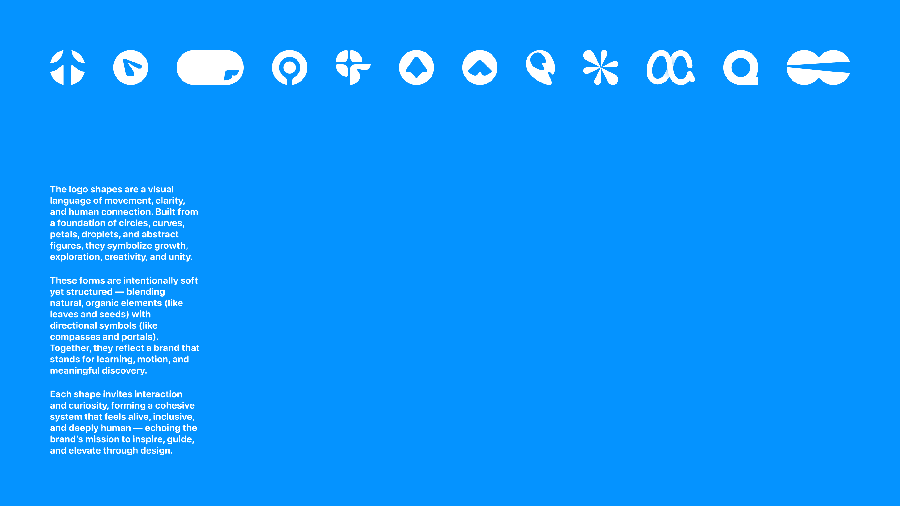
Logo design
Brand identity
We partnered with OQ, a platform that promotes clarity, inspiration, and critical thinking through an interactive, engaging reading experience. Our task was to craft a full visual identity — from logo and branding to UX/UI and illustrations — with a focus on minimalist design.
In Kazakh, “OQ” means both “bullet” and “oqy” (“to read”). This dual meaning became the foundation of our concept: a symbol of progress, acceleration, and learning. The logo draws inspiration from the shape of a shuttle or arrow — representing movement toward growth and knowledge through the complexities of self-improvement.
To reflect OQ’s educational and gamified nature, we built a vibrant, energetic color system. The result is a bold yet refined identity that invites users into an inspiring world of reading and discovery.